A composable, themeable and customizable sidebar component.
Sidebars are one of the most complex components to build. They are central to any application and often contain a lot of moving parts.
We now have a solid foundation to build on top of. Composable. Themeable. Customizable.
Installation
shadcn-templ add sidebarCopy and paste the following code into your project.
package sidebar import ( "context" "math/rand" "strconv" "github.com/axadrn/shadcn-templ/v2/components/button" "github.com/axadrn/shadcn-templ/v2/components/icon" "github.com/axadrn/shadcn-templ/v2/components/input" "github.com/axadrn/shadcn-templ/v2/components/sheet" "github.com/axadrn/shadcn-templ/v2/components/skeleton" "github.com/axadrn/shadcn-templ/v2/components/tooltip" "github.com/axadrn/shadcn-templ/v2/utils") // The pendant of shadcn's sidebar.tsx constants: edit these to change the// sidebar widths and the toggle key.const ( sidebarWidth = "16rem" sidebarWidthMobile = "18rem" sidebarWidthIcon = "3rem" sidebarKeyboardShortcut = "b") type contextKey string const ( sidebarIDKey contextKey = "sidebar-id" sidebarStateKey contextKey = "sidebar-state") type ctxState struct { collapsed bool collapsible Collapsible} func sidebarID(ctx context.Context) string { if id, ok := ctx.Value(sidebarIDKey).(string); ok { return id } return ""} func sidebarState(ctx context.Context) ctxState { if s, ok := ctx.Value(sidebarStateKey).(ctxState); ok { return s } return ctxState{}} type Side string const ( SideLeft Side = "left" // default SideRight Side = "right") type Variant string const ( VariantSidebar Variant = "sidebar" // default VariantFloating Variant = "floating" VariantInset Variant = "inset") type Collapsible string const ( CollapsibleOffcanvas Collapsible = "offcanvas" // default CollapsibleIcon Collapsible = "icon" CollapsibleNone Collapsible = "none") type MenuButtonVariant string const ( MenuButtonVariantDefault MenuButtonVariant = "default" MenuButtonVariantOutline MenuButtonVariant = "outline") type MenuButtonSize string const ( MenuButtonSizeDefault MenuButtonSize = "default" // default MenuButtonSizeSm MenuButtonSize = "sm" MenuButtonSizeLg MenuButtonSize = "lg") type MenuSubButtonSize string const ( MenuSubButtonSizeMd MenuSubButtonSize = "md" // default MenuSubButtonSizeSm MenuSubButtonSize = "sm") type Props struct { ID string Class string Attributes templ.Attributes Side Side // default: "left" Variant Variant // default: "sidebar" Collapsible Collapsible // default: "offcanvas"} type ProviderProps struct { ID string Class string Attributes templ.Attributes // DisableDefaultOpen renders the sidebar collapsed on page load, the zero-value // inversion of SidebarProvider's defaultOpen (true). DisableDefaultOpen bool} type TriggerProps struct { ID string Class string Attributes templ.Attributes Target string // Target sidebar ID to toggle} type RailProps struct { Class string Attributes templ.Attributes} type InsetProps struct { ID string Class string Attributes templ.Attributes} type InputProps struct { ID string Class string Attributes templ.Attributes Name string Value string Placeholder string} type HeaderProps struct { ID string Class string Attributes templ.Attributes} type FooterProps struct { ID string Class string Attributes templ.Attributes} type SeparatorProps struct { ID string Class string Attributes templ.Attributes} type ContentProps struct { ID string Class string Attributes templ.Attributes} type GroupProps struct { ID string Class string Attributes templ.Attributes} type GroupLabelProps struct { ID string Class string Attributes templ.Attributes} type GroupActionProps struct { ID string Class string Attributes templ.Attributes} type GroupContentProps struct { ID string Class string Attributes templ.Attributes} type MenuProps struct { ID string Class string Attributes templ.Attributes} type MenuItemProps struct { ID string Class string Attributes templ.Attributes} type MenuButtonProps struct { ID string Class string Attributes templ.Attributes Href string IsActive bool Variant MenuButtonVariant // default: "default" Size MenuButtonSize // default: "default" Tooltip string // Tooltip text to show when sidebar is collapsed to icons} type MenuActionProps struct { ID string Class string Attributes templ.Attributes // ShowOnHover reveals the action only while its menu item is hovered. ShowOnHover bool} type MenuBadgeProps struct { ID string Class string Attributes templ.Attributes} type MenuSkeletonProps struct { ID string Class string Attributes templ.Attributes ShowIcon bool} type MenuSubProps struct { ID string Class string Attributes templ.Attributes} type MenuSubItemProps struct { ID string Class string Attributes templ.Attributes} type MenuSubButtonProps struct { ID string Class string Attributes templ.Attributes Href string IsActive bool Size MenuSubButtonSize // default: "md"} // Provider is the SidebarProvider pendant: it hosts the width variables and// the has-data-[variant=inset] background.templ Provider(props ...ProviderProps) { {{ var p ProviderProps }} if len(props) > 0 { {{ p = props[0] }} } {{ var layoutID string = p.ID }} if layoutID == "" { {{ layoutID = utils.RandomID() }} } {{ ctx = context.WithValue(ctx, sidebarIDKey, layoutID) }} {{ ctx = context.WithValue(ctx, sidebarStateKey, ctxState{collapsed: p.DisableDefaultOpen}) }} <div data-slot="sidebar-wrapper" class={ utils.CN( "group/sidebar-wrapper flex min-h-svh w-full has-data-[variant=inset]:bg-sidebar", p.Class, ) } { utils.MergeAttributes( templ.Attributes{"style": "--sidebar-width: " + sidebarWidth + "; --sidebar-width-icon: " + sidebarWidthIcon + ";"}, p.Attributes, )... } > { children... } </div>} templ Sidebar(props ...Props) { {{ var p Props }} if len(props) > 0 { {{ p = props[0] }} } if p.ID == "" { if ctxId := ctx.Value(sidebarIDKey); ctxId != nil { {{ p.ID = ctxId.(string) }} } else { {{ p.ID = utils.RandomID() }} } } if p.Side == "" { {{ p.Side = SideLeft }} } if p.Variant == "" { {{ p.Variant = VariantSidebar }} } if p.Collapsible == "" { {{ p.Collapsible = CollapsibleOffcanvas }} } {{ s := sidebarState(ctx) }} {{ ctx = context.WithValue(ctx, sidebarIDKey, p.ID) }} {{ ctx = context.WithValue(ctx, sidebarStateKey, ctxState{collapsed: s.collapsed, collapsible: p.Collapsible}) }} if p.Collapsible == CollapsibleNone { <div id={ p.ID } data-slot="sidebar" class={ utils.CN( "flex h-full w-(--sidebar-width) flex-col bg-sidebar text-sidebar-foreground", p.Class, ) } { p.Attributes... } > { children... } </div> } else { {{ var sheetSide = sheet.SideLeft }} if p.Side == SideRight { {{ sheetSide = sheet.SideRight }} } <!-- Mobile: the sidebar content moves into this sheet below md --> @sheet.Sheet(sheet.Props{ ID: p.ID + "-mobile", }) { @sheet.Content(sheet.ContentProps{ Side: sheetSide, Class: "w-(--sidebar-width) bg-sidebar p-0 text-sidebar-foreground [&>button]:hidden md:hidden", Attributes: templ.Attributes{ "data-sidebar": "sidebar", "data-mobile": "true", "style": "--sidebar-width: " + sidebarWidthMobile + ";", }, }) { @sheet.Header(sheet.HeaderProps{Class: "sr-only"}) { @sheet.Title() { Sidebar } @sheet.Description() { Displays the mobile sidebar. } } <div class="flex h-full w-full flex-col" data-tui-sidebar-mobile-portal={ p.ID }></div> } } <!-- Desktop --> <div class="group peer hidden text-sidebar-foreground md:block" data-state={ utils.IfElse(s.collapsed, "collapsed", "expanded") } data-collapsible={ utils.IfElse(s.collapsed, string(p.Collapsible), "") } data-variant={ string(p.Variant) } data-side={ string(p.Side) } data-slot="sidebar" data-tui-sidebar-wrapper data-tui-sidebar-id={ p.ID } data-tui-sidebar-collapsible-mode={ string(p.Collapsible) } data-tui-sidebar-keyboard-shortcut={ sidebarKeyboardShortcut } > <!-- Gap element that keeps the sidebar width in the document flow --> <div data-slot="sidebar-gap" class={ utils.CN( "cn-sidebar-gap relative w-(--sidebar-width) bg-transparent", "group-data-[collapsible=offcanvas]:w-0", "group-data-[side=right]:rotate-180", utils.IfElse( p.Variant == VariantFloating || p.Variant == VariantInset, "group-data-[collapsible=icon]:w-[calc(var(--sidebar-width-icon)+(--spacing(4)))]", "group-data-[collapsible=icon]:w-(--sidebar-width-icon)", ), ) } ></div> <div id={ p.ID } data-slot="sidebar-container" data-side={ string(p.Side) } class={ utils.CN( "fixed inset-y-0 z-10 hidden h-svh w-(--sidebar-width) transition-[left,right,width] duration-200 ease-linear data-[side=left]:left-0 data-[side=left]:group-data-[collapsible=offcanvas]:left-[calc(var(--sidebar-width)*-1)] data-[side=right]:right-0 data-[side=right]:group-data-[collapsible=offcanvas]:right-[calc(var(--sidebar-width)*-1)] md:flex", utils.IfElse( p.Variant == VariantFloating || p.Variant == VariantInset, "p-2 group-data-[collapsible=icon]:w-[calc(var(--sidebar-width-icon)+(--spacing(4))+2px)]", "group-data-[collapsible=icon]:w-(--sidebar-width-icon) group-data-[side=left]:border-r group-data-[side=right]:border-l", ), p.Class, ) } { p.Attributes... } > <div data-sidebar="sidebar" data-slot="sidebar-inner" class="cn-sidebar-inner flex size-full flex-col" > <div data-tui-sidebar-content={ p.ID } class="flex h-full w-full flex-col"> { children... } </div> </div> </div> </div> }} // Trigger toggles the sidebar: below md it opens the mobile sheet, on// desktop it collapses/expands (the script decides).templ Trigger(props ...TriggerProps) { {{ var p TriggerProps }} if len(props) > 0 { {{ p = props[0] }} } {{ var targetID = p.Target }} if targetID == "" { {{ targetID = sidebarID(ctx) }} } @button.Button(button.Props{ ID: p.ID, Size: button.SizeIconSm, Variant: button.VariantGhost, Class: utils.CN("cn-sidebar-trigger", p.Class), Attributes: utils.MergeAttributes( templ.Attributes{ "data-sidebar": "trigger", "data-slot": "sidebar-trigger", "data-tui-sidebar-trigger": true, "data-tui-sidebar-target": targetID, }, p.Attributes, ), }) { @icon.PanelLeft(icon.Props{Class: "cn-rtl-flip"}) <span class="sr-only">Toggle Sidebar</span> }} // Rail is the invisible strip on the sidebar edge that toggles it on click.templ Rail(props ...RailProps) { {{ var p RailProps }} if len(props) > 0 { {{ p = props[0] }} } <button type="button" data-sidebar="rail" data-slot="sidebar-rail" data-tui-sidebar-trigger data-tui-sidebar-target={ sidebarID(ctx) } data-tui-sidebar-rail aria-label="Toggle Sidebar" tabindex="-1" title="Toggle Sidebar" class={ utils.CN( "cn-sidebar-rail absolute inset-y-0 z-20 hidden w-4 transition-all ease-linear group-data-[side=left]:-right-4 group-data-[side=right]:left-0 after:absolute after:inset-y-0 after:start-1/2 after:w-[2px] sm:flex ltr:-translate-x-1/2 rtl:-translate-x-1/2", "in-data-[side=left]:cursor-w-resize in-data-[side=right]:cursor-e-resize", "[[data-side=left][data-state=collapsed]_&]:cursor-e-resize [[data-side=right][data-state=collapsed]_&]:cursor-w-resize", "group-data-[collapsible=offcanvas]:translate-x-0 group-data-[collapsible=offcanvas]:after:left-full hover:group-data-[collapsible=offcanvas]:bg-sidebar", "[[data-side=left][data-collapsible=offcanvas]_&]:-right-2", "[[data-side=right][data-collapsible=offcanvas]_&]:-left-2", p.Class, ) } { p.Attributes... } ></button>} templ Inset(props ...InsetProps) { {{ var p InsetProps }} if len(props) > 0 { {{ p = props[0] }} } <main if p.ID != "" { id={ p.ID } } data-slot="sidebar-inset" class={ utils.CN( "cn-sidebar-inset relative flex w-full flex-1 flex-col", p.Class, ) } { p.Attributes... } > { children... } </main>} templ Input(props ...InputProps) { {{ var p InputProps }} if len(props) > 0 { {{ p = props[0] }} } @input.Input(input.Props{ ID: p.ID, Name: p.Name, Value: p.Value, Placeholder: p.Placeholder, Class: utils.CN("cn-sidebar-input", p.Class), Attributes: utils.MergeAttributes( templ.Attributes{"data-slot": "sidebar-input", "data-sidebar": "input"}, p.Attributes, ), })} templ Header(props ...HeaderProps) { {{ var p HeaderProps }} if len(props) > 0 { {{ p = props[0] }} } <div if p.ID != "" { id={ p.ID } } data-slot="sidebar-header" data-sidebar="header" class={ utils.CN("cn-sidebar-header flex flex-col", p.Class) } { p.Attributes... } > { children... } </div>} templ Footer(props ...FooterProps) { {{ var p FooterProps }} if len(props) > 0 { {{ p = props[0] }} } <div if p.ID != "" { id={ p.ID } } data-slot="sidebar-footer" data-sidebar="footer" class={ utils.CN("cn-sidebar-footer flex flex-col", p.Class) } { p.Attributes... } > { children... } </div>} templ Separator(props ...SeparatorProps) { {{ var p SeparatorProps }} if len(props) > 0 { {{ p = props[0] }} } <div if p.ID != "" { id={ p.ID } } role="separator" data-slot="sidebar-separator" data-sidebar="separator" data-orientation="horizontal" class={ utils.CN( // The base separator classes the tsx inherits from ui/separator, // plus the sidebar override from sidebar.tsx. "shrink-0 bg-border data-horizontal:h-px data-horizontal:w-full data-vertical:w-px data-vertical:self-stretch", "cn-sidebar-separator w-auto", p.Class, ) } { p.Attributes... } ></div>} templ Content(props ...ContentProps) { {{ var p ContentProps }} if len(props) > 0 { {{ p = props[0] }} } <div if p.ID != "" { id={ p.ID } } data-slot="sidebar-content" data-sidebar="content" class={ utils.CN( "cn-sidebar-content flex min-h-0 flex-1 flex-col overflow-auto group-data-[collapsible=icon]:overflow-hidden", p.Class, ) } { p.Attributes... } > { children... } </div>} templ Group(props ...GroupProps) { {{ var p GroupProps }} if len(props) > 0 { {{ p = props[0] }} } <div if p.ID != "" { id={ p.ID } } data-slot="sidebar-group" data-sidebar="group" class={ utils.CN("cn-sidebar-group relative flex w-full min-w-0 flex-col", p.Class) } { p.Attributes... } > { children... } </div>} templ GroupLabel(props ...GroupLabelProps) { {{ var p GroupLabelProps }} if len(props) > 0 { {{ p = props[0] }} } <div if p.ID != "" { id={ p.ID } } data-slot="sidebar-group-label" data-sidebar="group-label" class={ utils.CN( "cn-sidebar-group-label flex shrink-0 items-center outline-hidden [&>svg]:shrink-0", p.Class, ) } { p.Attributes... } > { children... } </div>} templ GroupAction(props ...GroupActionProps) { {{ var p GroupActionProps }} if len(props) > 0 { {{ p = props[0] }} } <button if p.ID != "" { id={ p.ID } } type="button" data-slot="sidebar-group-action" data-sidebar="group-action" class={ utils.CN( "cn-sidebar-group-action flex aspect-square items-center justify-center outline-hidden transition-transform group-data-[collapsible=icon]:hidden after:absolute after:-inset-2 md:after:hidden [&>svg]:shrink-0", p.Class, ) } { p.Attributes... } > { children... } </button>} templ GroupContent(props ...GroupContentProps) { {{ var p GroupContentProps }} if len(props) > 0 { {{ p = props[0] }} } <div if p.ID != "" { id={ p.ID } } data-slot="sidebar-group-content" data-sidebar="group-content" class={ utils.CN("cn-sidebar-group-content w-full", p.Class) } { p.Attributes... } > { children... } </div>} templ Menu(props ...MenuProps) { {{ var p MenuProps }} if len(props) > 0 { {{ p = props[0] }} } <ul if p.ID != "" { id={ p.ID } } data-slot="sidebar-menu" data-sidebar="menu" class={ utils.CN("cn-sidebar-menu flex w-full min-w-0 flex-col", p.Class) } { p.Attributes... } > { children... } </ul>} templ MenuItem(props ...MenuItemProps) { {{ var p MenuItemProps }} if len(props) > 0 { {{ p = props[0] }} } <li if p.ID != "" { id={ p.ID } } data-slot="sidebar-menu-item" data-sidebar="menu-item" class={ utils.CN("group/menu-item relative", p.Class) } { p.Attributes... } > { children... } </li>} // 1:1 the sidebarMenuButtonVariants cva base: structure lives here, the look// comes from the active style-*.css via the cn-sidebar-menu-button-* classes.const menuButtonBaseClasses = "cn-sidebar-menu-button peer/menu-button group/menu-button flex w-full items-center overflow-hidden outline-hidden disabled:pointer-events-none disabled:opacity-50 aria-disabled:pointer-events-none aria-disabled:opacity-50 [&_svg]:size-4 [&_svg]:shrink-0 [&>span:last-child]:truncate" func menuButtonClasses(p MenuButtonProps) string { return utils.CN( menuButtonBaseClasses, menuButtonVariantClasses(p.Variant), menuButtonSizeClasses(p.Size), p.Class, )} func menuButtonVariantClasses(v MenuButtonVariant) string { switch v { case MenuButtonVariantOutline: return "cn-sidebar-menu-button-variant-outline" default: return "cn-sidebar-menu-button-variant-default" }} func menuButtonSizeClasses(s MenuButtonSize) string { switch s { case MenuButtonSizeSm: return "cn-sidebar-menu-button-size-sm" case MenuButtonSizeLg: return "cn-sidebar-menu-button-size-lg" default: return "cn-sidebar-menu-button-size-default" }} templ MenuButton(props ...MenuButtonProps) { {{ var p MenuButtonProps }} if len(props) > 0 { {{ p = props[0] }} } if p.Variant == "" { {{ p.Variant = MenuButtonVariantDefault }} } if p.Size == "" { {{ p.Size = MenuButtonSizeDefault }} } if p.Tooltip != "" { @tooltip.Tooltip() { {{ s := sidebarState(ctx) }} {{ tp := p }} {{ trigger := tooltip.Trigger(ctx) }} // The tooltip only shows while the sidebar is collapsed to icons; // the script keeps the attribute in sync on toggle. if !(s.collapsed && s.collapsible == CollapsibleIcon) { {{ trigger["data-tui-tooltip-disabled"] = true }} } {{ tp.Attributes = utils.MergeAttributes(trigger, p.Attributes) }} @menuButtonEl(tp) { { children... } } @tooltip.Content(tooltip.ContentProps{Side: tooltip.SideRight}) { { p.Tooltip } } } } else { @menuButtonEl(p) { { children... } } }} templ menuButtonEl(p MenuButtonProps) { if p.Href != "" { <a if p.ID != "" { id={ p.ID } } href={ templ.SafeURL(p.Href) } data-slot="sidebar-menu-button" data-sidebar="menu-button" data-size={ string(p.Size) } data-active?={ p.IsActive } class={ menuButtonClasses(p) } { p.Attributes... } > { children... } </a> } else { <button if p.ID != "" { id={ p.ID } } type="button" data-slot="sidebar-menu-button" data-sidebar="menu-button" data-size={ string(p.Size) } data-active?={ p.IsActive } class={ menuButtonClasses(p) } { p.Attributes... } > { children... } </button> }} templ MenuAction(props ...MenuActionProps) { {{ var p MenuActionProps }} if len(props) > 0 { {{ p = props[0] }} } <button if p.ID != "" { id={ p.ID } } type="button" data-slot="sidebar-menu-action" data-sidebar="menu-action" class={ utils.CN( "cn-sidebar-menu-action flex items-center justify-center outline-hidden transition-transform group-data-[collapsible=icon]:hidden after:absolute after:-inset-2 md:after:hidden [&>svg]:shrink-0", map[string]bool{"group-focus-within/menu-item:opacity-100 group-hover/menu-item:opacity-100 peer-data-active/menu-button:text-sidebar-accent-foreground aria-expanded:opacity-100 md:opacity-0": p.ShowOnHover}, p.Class, ) } { p.Attributes... } > { children... } </button>} templ MenuBadge(props ...MenuBadgeProps) { {{ var p MenuBadgeProps }} if len(props) > 0 { {{ p = props[0] }} } <div if p.ID != "" { id={ p.ID } } data-slot="sidebar-menu-badge" data-sidebar="menu-badge" class={ utils.CN( "cn-sidebar-menu-badge flex items-center justify-center tabular-nums select-none group-data-[collapsible=icon]:hidden", p.Class, ) } { p.Attributes... } > { children... } </div>} templ MenuSkeleton(props ...MenuSkeletonProps) { {{ var p MenuSkeletonProps }} if len(props) > 0 { {{ p = props[0] }} } // Random width between 50 and 90%, like shadcn. {{ width := strconv.Itoa(rand.Intn(40)+50) + "%" }} <div if p.ID != "" { id={ p.ID } } data-slot="sidebar-menu-skeleton" data-sidebar="menu-skeleton" class={ utils.CN("cn-sidebar-menu-skeleton flex items-center", p.Class) } { p.Attributes... } > if p.ShowIcon { @skeleton.Skeleton(skeleton.Props{ Class: "cn-sidebar-menu-skeleton-icon", Attributes: templ.Attributes{"data-sidebar": "menu-skeleton-icon"}, }) } @skeleton.Skeleton(skeleton.Props{ Class: "cn-sidebar-menu-skeleton-text max-w-(--skeleton-width) flex-1", Attributes: templ.Attributes{ "data-sidebar": "menu-skeleton-text", "style": "--skeleton-width: " + width + ";", }, }) </div>} templ MenuSub(props ...MenuSubProps) { {{ var p MenuSubProps }} if len(props) > 0 { {{ p = props[0] }} } <ul if p.ID != "" { id={ p.ID } } data-slot="sidebar-menu-sub" data-sidebar="menu-sub" class={ utils.CN( "cn-sidebar-menu-sub flex min-w-0 flex-col", p.Class, ) } { p.Attributes... } > { children... } </ul>} templ MenuSubItem(props ...MenuSubItemProps) { {{ var p MenuSubItemProps }} if len(props) > 0 { {{ p = props[0] }} } <li if p.ID != "" { id={ p.ID } } data-slot="sidebar-menu-sub-item" data-sidebar="menu-sub-item" class={ utils.CN("group/menu-sub-item relative", p.Class) } { p.Attributes... } > { children... } </li>} func menuSubButtonClasses(p MenuSubButtonProps) string { return utils.CN( "cn-sidebar-menu-sub-button flex min-w-0 -translate-x-px items-center overflow-hidden outline-hidden group-data-[collapsible=icon]:hidden disabled:pointer-events-none disabled:opacity-50 aria-disabled:pointer-events-none aria-disabled:opacity-50 [&>span:last-child]:truncate [&>svg]:shrink-0", p.Class, )} templ MenuSubButton(props ...MenuSubButtonProps) { {{ var p MenuSubButtonProps }} if len(props) > 0 { {{ p = props[0] }} } if p.Size == "" { {{ p.Size = MenuSubButtonSizeMd }} } if p.Href != "" { <a if p.ID != "" { id={ p.ID } } href={ templ.SafeURL(p.Href) } data-slot="sidebar-menu-sub-button" data-sidebar="menu-sub-button" data-size={ string(p.Size) } data-active?={ p.IsActive } class={ menuSubButtonClasses(p) } { p.Attributes... } > { children... } </a> } else { <button if p.ID != "" { id={ p.ID } } type="button" data-slot="sidebar-menu-sub-button" data-sidebar="menu-sub-button" data-size={ string(p.Size) } data-active?={ p.IsActive } class={ utils.CN(menuSubButtonClasses(p), "w-full text-left") } { p.Attributes... } > { children... } </button> }}(function () { "use strict"; const SIDEBAR_COOKIE_NAME = "sidebar_state"; const SIDEBAR_COOKIE_MAX_AGE = 60 * 60 * 24 * 7; // 7 days const MOBILE_QUERY = "(max-width: 767px)"; function wrapperFor(sidebarId) { return document.querySelector( '[data-tui-sidebar-wrapper][data-tui-sidebar-id="' + sidebarId + '"]', ); } // The sidebar content renders once and moves between the desktop container // and the mobile sheet, depending on the viewport. function setupMobilePortals() { document.querySelectorAll("[data-tui-sidebar-content]").forEach((content) => { const sidebarId = content.getAttribute("data-tui-sidebar-content"); const portal = document.querySelector( '[data-tui-sidebar-mobile-portal="' + sidebarId + '"]', ); if (!portal) return; const isMobile = window.matchMedia(MOBILE_QUERY).matches; if (isMobile && content.parentElement !== portal) { portal.appendChild(content); } else if (!isMobile && content.parentElement === portal) { const inner = wrapperFor(sidebarId)?.querySelector('[data-slot="sidebar-inner"]'); if (inner) inner.appendChild(content); } }); } setupMobilePortals(); window.addEventListener("resize", setupMobilePortals); new MutationObserver(setupMobilePortals).observe(document.body, { childList: true, subtree: true, }); function toggleSidebar(sidebarId) { // Below md the trigger opens the mobile sheet instead of collapsing. if (window.matchMedia(MOBILE_QUERY).matches) { window.tui?.dialog?.toggle(sidebarId + "-mobile"); return; } const wrapper = wrapperFor(sidebarId); if (!wrapper) return; const mode = wrapper.getAttribute("data-tui-sidebar-collapsible-mode"); if (mode === "none") return; const collapsed = wrapper.getAttribute("data-state") !== "collapsed"; wrapper.setAttribute("data-state", collapsed ? "collapsed" : "expanded"); // Like shadcn, data-collapsible carries the mode only while collapsed, // so icon/offcanvas selectors need no extra state check. wrapper.setAttribute("data-collapsible", collapsed ? mode : ""); // Menu button tooltips only show while collapsed to icons. const tooltipsDisabled = !(collapsed && mode === "icon"); wrapper.querySelectorAll("[data-tui-tooltip-trigger]").forEach((trigger) => { trigger.toggleAttribute("data-tui-tooltip-disabled", tooltipsDisabled); }); document.cookie = SIDEBAR_COOKIE_NAME + "=" + (collapsed ? "false" : "true") + "; path=/; max-age=" + SIDEBAR_COOKIE_MAX_AGE; } document.addEventListener("click", (e) => { if (!(e.target instanceof Element)) return; const trigger = e.target.closest("[data-tui-sidebar-trigger]"); if (!trigger) return; const targetId = trigger.getAttribute("data-tui-sidebar-target"); if (targetId) toggleSidebar(targetId); }); // The useSidebar pendant: the same seven members as the React hook, // addressing the first sidebar unless a sidebarId is given. function anyWrapper(sidebarId) { return sidebarId ? wrapperFor(sidebarId) : document.querySelector("[data-tui-sidebar-wrapper]"); } window.tui = window.tui || {}; window.tui.sidebar = { state(sidebarId) { return anyWrapper(sidebarId)?.getAttribute("data-state") || null; }, open(sidebarId) { return this.state(sidebarId) === "expanded"; }, setOpen(open, sidebarId) { const wrapper = anyWrapper(sidebarId); if (!wrapper) return; if (this.open(sidebarId) !== open) { toggleSidebar(wrapper.getAttribute("data-tui-sidebar-id")); } }, openMobile(sidebarId) { const wrapper = anyWrapper(sidebarId); const sheet = wrapper && document.getElementById(wrapper.getAttribute("data-tui-sidebar-id") + "-mobile"); return !!(sheet && sheet.open); }, setOpenMobile(open, sidebarId) { const wrapper = anyWrapper(sidebarId); if (!wrapper) return; const id = wrapper.getAttribute("data-tui-sidebar-id") + "-mobile"; if (open) window.tui?.dialog?.open(id); else window.tui?.dialog?.close(id); }, isMobile() { return window.matchMedia(MOBILE_QUERY).matches; }, toggleSidebar(sidebarId) { const wrapper = anyWrapper(sidebarId); if (wrapper) toggleSidebar(wrapper.getAttribute("data-tui-sidebar-id")); }, }; // Cmd/Ctrl + shortcut key toggles the sidebar. document.addEventListener("keydown", (e) => { if (!(e.ctrlKey || e.metaKey) || e.key.length !== 1) return; const wrapper = document.querySelector("[data-tui-sidebar-wrapper]"); if (!wrapper) return; const shortcut = wrapper.getAttribute("data-tui-sidebar-keyboard-shortcut"); if (!shortcut || shortcut.toLowerCase() !== e.key.toLowerCase()) return; e.preventDefault(); toggleSidebar(wrapper.getAttribute("data-tui-sidebar-id")); });})();Component scripts are loaded through the shared script bundle, see JavaScript.
Update the import paths to match your project setup.
Usage
import "github.com/axadrn/shadcn-templ/v2/components/sidebar" templ Layout() { @sidebar.Provider() { @AppSidebar() <main> @sidebar.Trigger() { children... } </main> }}templ AppSidebar() { @sidebar.Sidebar() { @sidebar.Header() @sidebar.Content() { @sidebar.Group() @sidebar.Group() } @sidebar.Footer() }}Composition
Use the following composition to build a Sidebar layout:
sidebar.Provider├── sidebar.Sidebar│ ├── sidebar.Header│ ├── sidebar.Content│ │ ├── sidebar.Group│ │ │ ├── sidebar.GroupLabel│ │ │ ├── sidebar.GroupAction│ │ │ ├── sidebar.GroupContent│ │ │ └── sidebar.Menu│ │ │ ├── sidebar.MenuItem│ │ │ │ ├── sidebar.MenuButton│ │ │ │ ├── sidebar.MenuAction│ │ │ │ └── sidebar.MenuBadge│ │ │ └── sidebar.MenuItem│ │ │ ├── sidebar.MenuButton│ │ │ └── sidebar.MenuSub│ │ │ ├── sidebar.MenuSubItem│ │ │ └── sidebar.MenuSubItem│ │ └── sidebar.Group│ │ └── sidebar.Menu│ │ ├── sidebar.MenuItem│ │ └── sidebar.MenuItem│ ├── sidebar.Footer│ └── sidebar.Rail├── sidebar.Inset└── sidebar.TriggerStructure
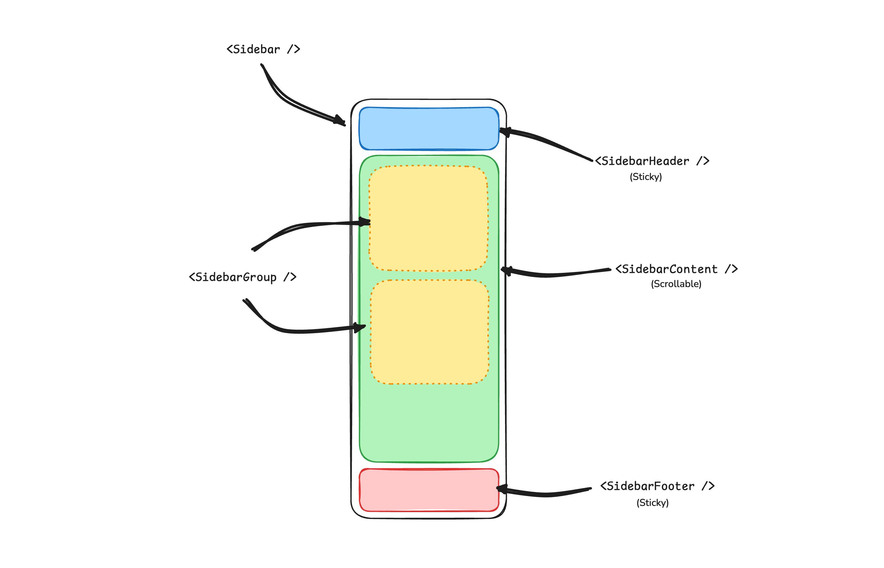
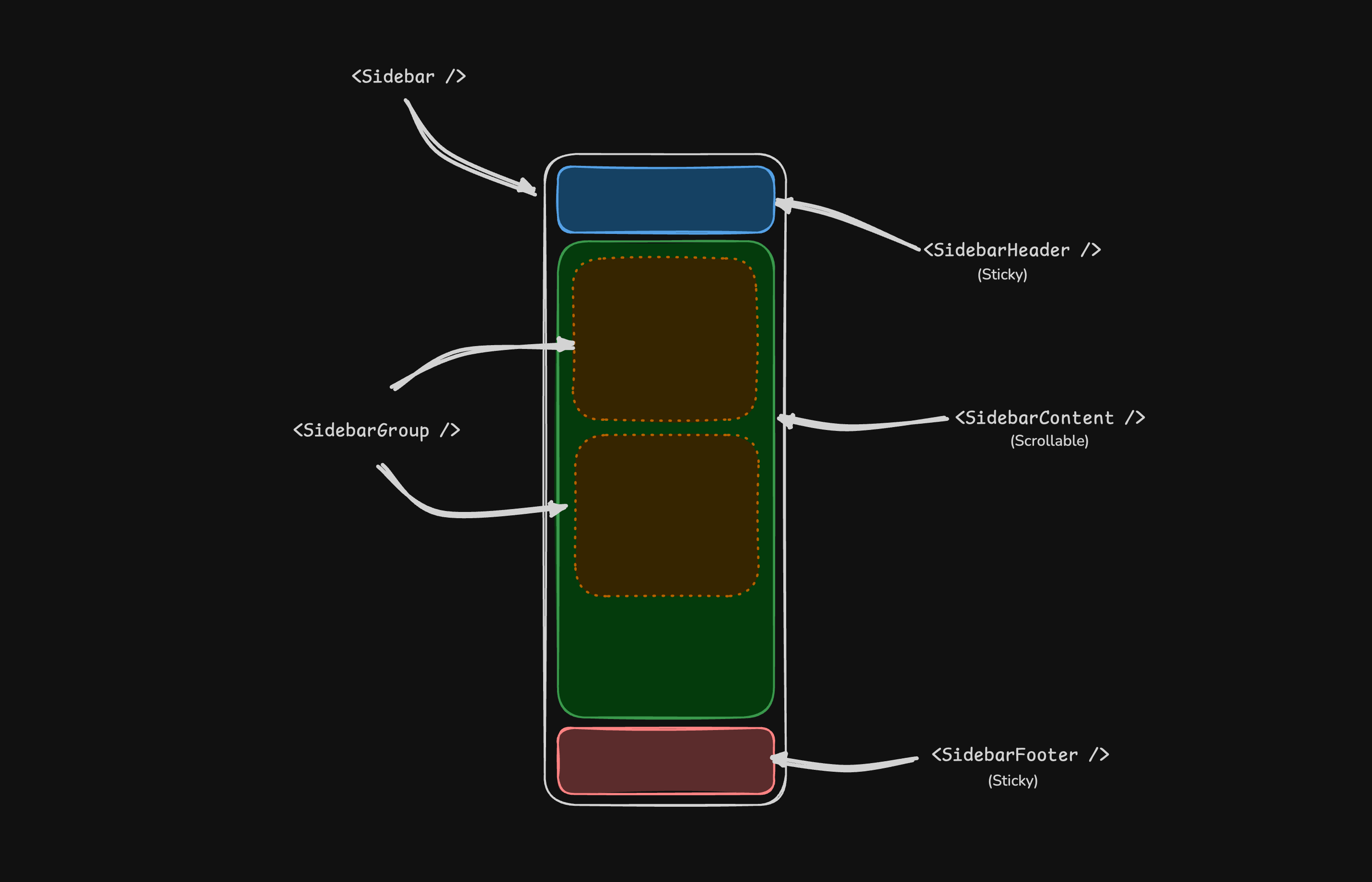
- sidebar.Provider — Handles collapsible state and provides the sidebar context to child components.
- sidebar.Sidebar — The main collapsible sidebar panel.
- sidebar.Header — Sticky at the top; use for branding, titles, or workspace switchers.
- sidebar.Footer — Sticky at the bottom; use for user menus, settings, or actions.
- sidebar.Content — Scrollable region between the header and footer.
- sidebar.Group — Groups related navigation with optional label, action, and content areas.
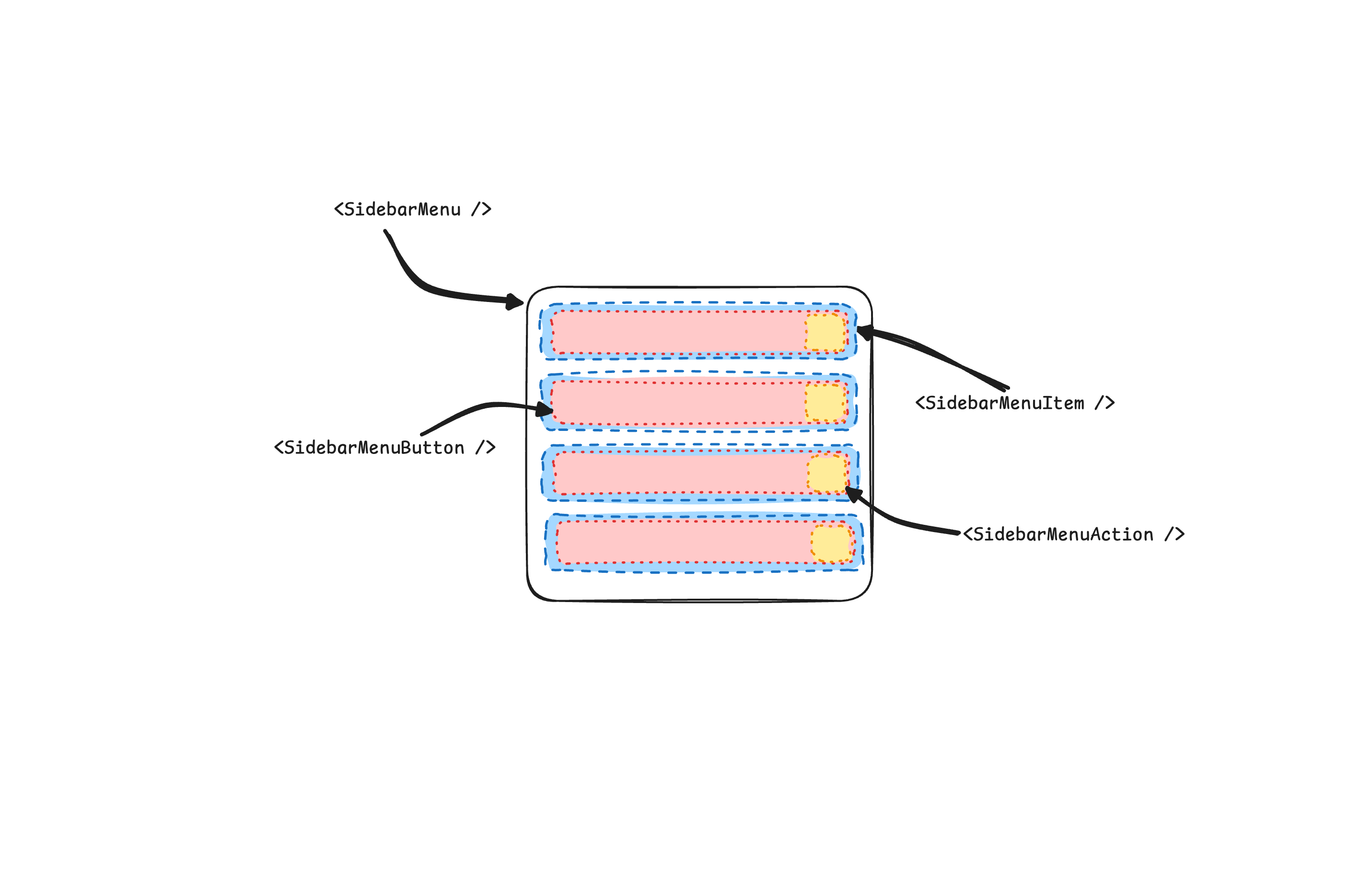
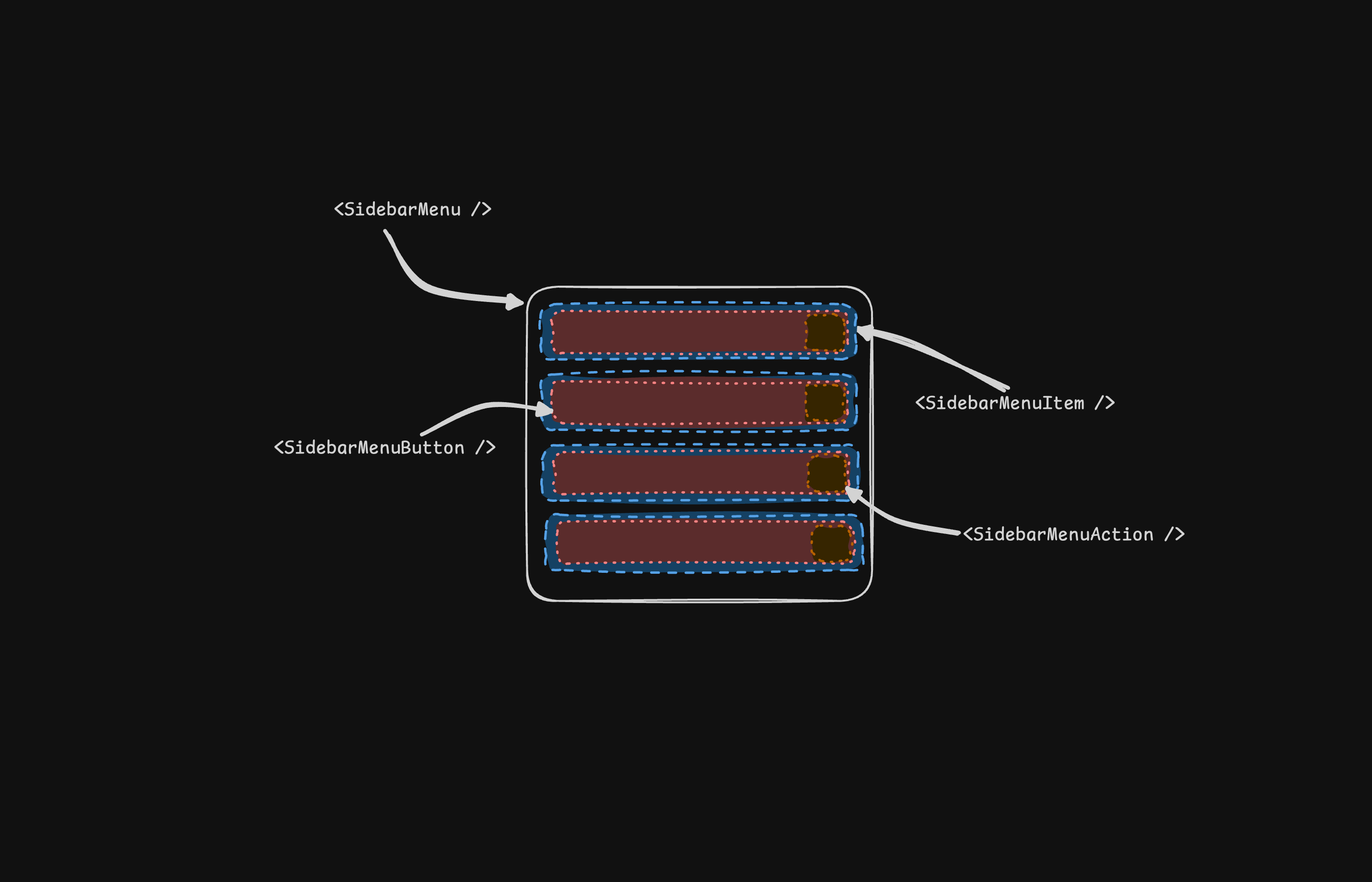
- sidebar.Menu / sidebar.MenuItem — Menu structure for links, badges, actions, and nested submenus.
- sidebar.Rail — Resize handle for adjusting sidebar width when applicable.
- sidebar.Inset — Wraps main content when using the
insetvariant. - sidebar.Trigger — Control that toggles the sidebar open or collapsed.
SidebarProvider
The sidebar.Provider component provides the sidebar context to the sidebar.Sidebar component. You should always wrap your application in a sidebar.Provider component.
Props
| Name | Type | Description |
|---|---|---|
DisableDefaultOpen |
bool |
Default collapsed state of the sidebar. |
Width
If you have a single sidebar in your application, you can use the sidebarWidth and sidebarWidthMobile constants in sidebar.templ to set the width of the sidebar.
sidebarWidth = "16rem"sidebarWidthMobile = "18rem"For multiple sidebars in your application, you can use the --sidebar-width and --sidebar-width-mobile CSS variables in the style attribute.
@sidebar.Provider(sidebar.ProviderProps{ Attributes: templ.Attributes{ "style": "--sidebar-width: 20rem; --sidebar-width-mobile: 20rem;", },}) { @sidebar.Sidebar()}Keyboard Shortcut
To trigger the sidebar, you use the cmd+b keyboard shortcut on Mac and ctrl+b on Windows.
sidebarKeyboardShortcut = "b"Sidebar
The main sidebar.Sidebar component used to render a collapsible sidebar.
Props
| Property | Type | Description |
|---|---|---|
Side |
SideLeft or SideRight |
The side of the sidebar. |
Variant |
VariantSidebar, VariantFloating, or VariantInset |
The variant of the sidebar. |
Collapsible |
CollapsibleOffcanvas, CollapsibleIcon, or CollapsibleNone |
Collapsible state of the sidebar. |
| Collapsible | Description |
|---|---|
offcanvas |
A collapsible sidebar that slides in from the left or right. |
icon |
A sidebar that collapses to icons. |
none |
A non-collapsible sidebar. |
Note: If you use the inset variant, remember to wrap your main content
in a sidebar.Inset component.
@sidebar.Provider() { @sidebar.Sidebar(sidebar.Props{Variant: sidebar.VariantInset}) @sidebar.Inset() { <main>{ children... }</main> }}useSidebar
The window.tui.sidebar API is the useSidebar pendant and is used to control the sidebar.
const { state, open, setOpen, openMobile, setOpenMobile, isMobile, toggleSidebar,} = window.tui.sidebar| Property | Type | Description |
|---|---|---|
state |
"expanded" | "collapsed" |
The current state of the sidebar. |
open |
() => boolean |
Whether the sidebar is open. |
setOpen |
(open: boolean) => void |
Sets the open state of the sidebar. |
openMobile |
() => boolean |
Whether the sidebar is open on mobile. |
setOpenMobile |
(open: boolean) => void |
Sets the open state of the sidebar on mobile. |
isMobile |
() => boolean |
Whether the sidebar is on mobile. |
toggleSidebar |
() => void |
Toggles the sidebar. Desktop and mobile. |
For multiple sidebars, every function optionally takes the sidebar ID as its last argument, e.g. toggleSidebar("left-nav"). Without an ID the first sidebar on the page is addressed.
SidebarHeader
Use the sidebar.Header component to add a sticky header to the sidebar.
@sidebar.Sidebar() { @sidebar.Header() { @sidebar.Menu() { @sidebar.MenuItem() { @dropdownmenu.DropdownMenu() { @sidebar.MenuButton(sidebar.MenuButtonProps{ Attributes: dropdownmenu.Trigger(ctx), }) { Select Workspace @icon.ChevronDown(icon.Props{Class: "ml-auto"}) } @dropdownmenu.Content() { @dropdownmenu.Item() { <span>Acme Inc</span> } } } } } }}SidebarFooter
Use the sidebar.Footer component to add a sticky footer to the sidebar.
@sidebar.Sidebar() { @sidebar.Footer() { @sidebar.Menu() { @sidebar.MenuItem() { @sidebar.MenuButton() { @icon.User() Username } } } }}SidebarContent
The sidebar.Content component is used to wrap the content of the sidebar. This is where you add your sidebar.Group components. It is scrollable.
@sidebar.Sidebar() { @sidebar.Content() { @sidebar.Group() @sidebar.Group() }}SidebarGroup
Use the sidebar.Group component to create a section within the sidebar.
A sidebar.Group has a sidebar.GroupLabel, a sidebar.GroupContent and an optional sidebar.GroupAction.
@sidebar.Group() { @sidebar.GroupLabel() { Application } @sidebar.GroupAction() { @icon.Plus() <span class="sr-only">Add Project</span> } @sidebar.GroupContent()}To make a sidebar.Group collapsible, wrap it in a Collapsible.
@collapsible.Collapsible(collapsible.Props{Open: true, Class: "group/collapsible"}) { @sidebar.Group() { @sidebar.GroupLabel(sidebar.GroupLabelProps{ Attributes: collapsible.Trigger(ctx), }) { Help @icon.ChevronDown(icon.Props{Class: "ml-auto transition-transform group-data-[state=open]/collapsible:rotate-180"}) } @collapsible.Content() { @sidebar.GroupContent() } }}SidebarMenu
The sidebar.Menu component is used for building a menu within a sidebar.Group.
@sidebar.Menu() { for _, project := range projects { @sidebar.MenuItem() { @sidebar.MenuButton(sidebar.MenuButtonProps{Href: project.URL}) { @project.Icon() <span>{ project.Name }</span> } } }}SidebarMenuButton
The sidebar.MenuButton component is used to render a menu button within a sidebar.MenuItem.
By default, the sidebar.MenuButton renders a button. Set the Href prop to render an a tag instead.
Use the IsActive prop to mark a menu item as active.
@sidebar.MenuButton(sidebar.MenuButtonProps{Href: "#", IsActive: true}) { Home}SidebarMenuAction
The sidebar.MenuAction component is used to render a menu action within a sidebar.MenuItem.
@sidebar.MenuItem() { @sidebar.MenuButton(sidebar.MenuButtonProps{Href: "#"}) { @icon.House() <span>Home</span> } @sidebar.MenuAction() { @icon.Plus() <span class="sr-only">Add Project</span> }}SidebarMenuSub
The sidebar.MenuSub component is used to render a submenu within a sidebar.Menu.
@sidebar.MenuItem() { @sidebar.MenuButton() @sidebar.MenuSub() { @sidebar.MenuSubItem() { @sidebar.MenuSubButton() } }}SidebarMenuBadge
The sidebar.MenuBadge component is used to render a badge within a sidebar.MenuItem.
@sidebar.MenuItem() { @sidebar.MenuButton() @sidebar.MenuBadge() { 24 }}SidebarMenuSkeleton
The sidebar.MenuSkeleton component is used to render a skeleton for a sidebar.Menu.
@sidebar.Menu() { for range 5 { @sidebar.MenuItem() { @sidebar.MenuSkeleton() } }}SidebarTrigger
Use the sidebar.Trigger component to render a button that toggles the sidebar.
<button onclick="window.tui.sidebar.toggleSidebar()">Toggle Sidebar</button>SidebarRail
The sidebar.Rail component is used to render a rail within a sidebar.Sidebar. This rail can be used to toggle the sidebar.
@sidebar.Sidebar() { @sidebar.Header() @sidebar.Content() { @sidebar.Group() } @sidebar.Footer() @sidebar.Rail()}Controlled Sidebar
Use the DisableDefaultOpen prop on sidebar.Provider to render the sidebar collapsed on the server. The sidebar_state cookie carries the last state, so the server can render the sidebar the way the user left it.
@sidebar.Provider(sidebar.ProviderProps{DisableDefaultOpen: collapsedFromCookie})collapsed := falseif c, err := r.Cookie("sidebar_state"); err == nil { collapsed = c.Value == "false"}Theming
We use the following CSS variables to theme the sidebar.
:root { --sidebar: oklch(0.985 0 0); --sidebar-foreground: oklch(0% 0 0); --sidebar-primary: oklch(0.205 0 0); --sidebar-primary-foreground: oklch(0.985 0 0); --sidebar-accent: oklch(0.97 0 0); --sidebar-accent-foreground: oklch(0.205 0 0); --sidebar-border: oklch(0.922 0 0); --sidebar-ring: oklch(0.708 0 0);} .dark { --sidebar: oklch(0.205 0 0); --sidebar-foreground: oklch(0.985 0 0); --sidebar-primary: oklch(0.488 0.243 264.376); --sidebar-primary-foreground: oklch(0.985 0 0); --sidebar-accent: oklch(0.269 0 0); --sidebar-accent-foreground: oklch(0.985 0 0); --sidebar-border: oklch(1 0 0 / 10%); --sidebar-ring: oklch(0.439 0 0);}Styling
Here are some tips for styling the sidebar based on different states.
@sidebar.Sidebar(sidebar.Props{Collapsible: sidebar.CollapsibleIcon}) { @sidebar.Content() { @sidebar.Group(sidebar.GroupProps{Class: "group-data-[collapsible=icon]:hidden"}) }}@sidebar.MenuItem() { @sidebar.MenuButton() @sidebar.MenuAction(sidebar.MenuActionProps{Class: "peer-data-[active=true]/menu-button:opacity-100"})}