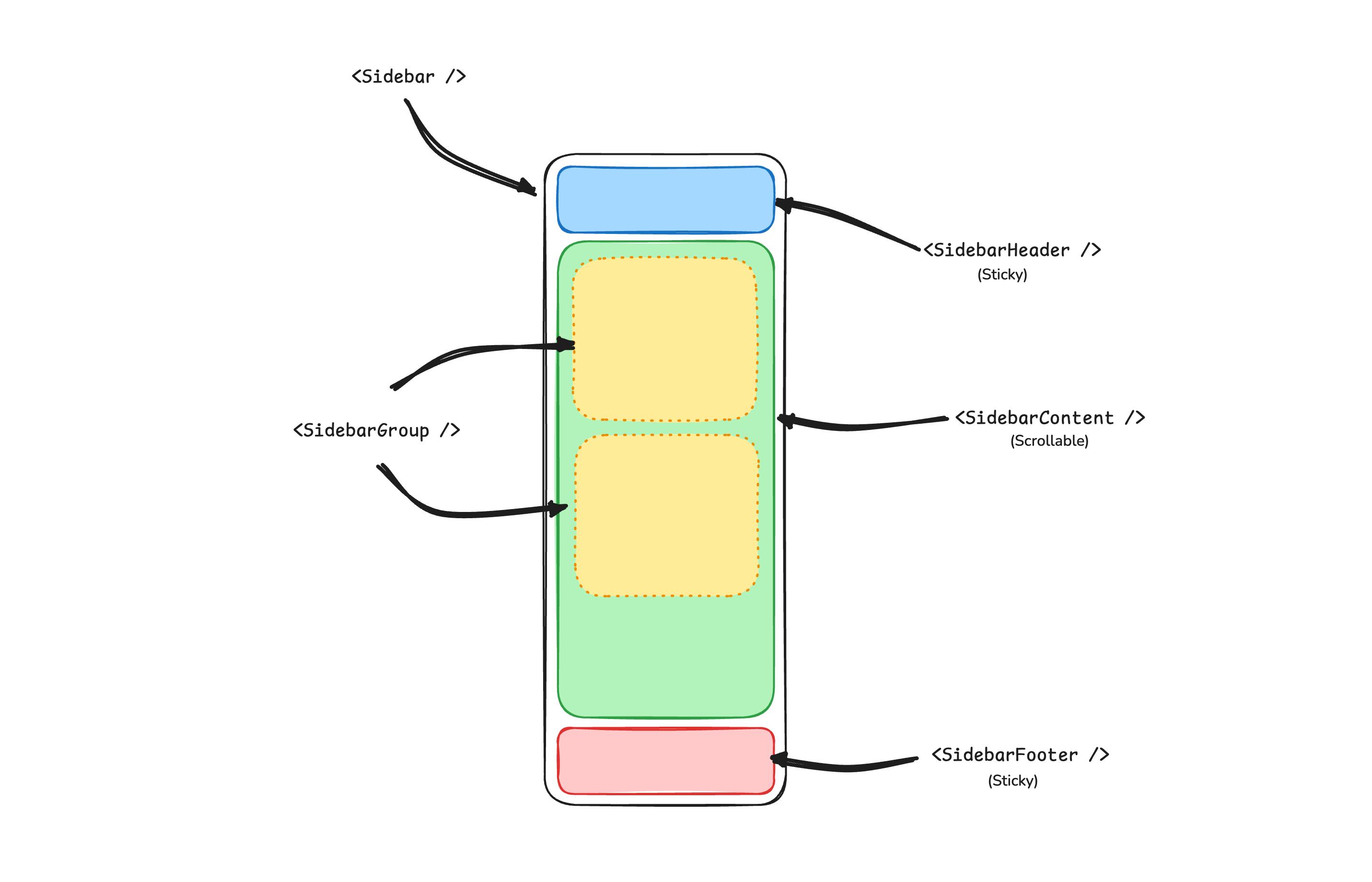
 ## SidebarProvider
The `sidebar.Provider` component provides the sidebar context to the `sidebar.Sidebar` component. You should always wrap your application in a `sidebar.Provider` component.
### Props
| Name | Type | Description |
| ----------- | ------ | --------------------------------------- |
| `DisableDefaultOpen` | `bool` | Default collapsed state of the sidebar. |
### Width
If you have a single sidebar in your application, you can use the `sidebarWidth` and `sidebarWidthMobile` constants in `sidebar.templ` to set the width of the sidebar.
```go showLineNumbers title="components/sidebar/sidebar.templ"
sidebarWidth = "16rem"
sidebarWidthMobile = "18rem"
```
For multiple sidebars in your application, you can use the `--sidebar-width` and `--sidebar-width-mobile` CSS variables in the `style` attribute.
```templ showLineNumbers
@sidebar.Provider(sidebar.ProviderProps{
Attributes: templ.Attributes{
"style": "--sidebar-width: 20rem; --sidebar-width-mobile: 20rem;",
},
}) {
@sidebar.Sidebar()
}
```
### Keyboard Shortcut
To trigger the sidebar, you use the `cmd+b` keyboard shortcut on Mac and `ctrl+b` on Windows.
```go showLineNumbers title="components/sidebar/sidebar.templ"
sidebarKeyboardShortcut = "b"
```
## Sidebar
The main `sidebar.Sidebar` component used to render a collapsible sidebar.
### Props
| Property | Type | Description |
| ------------- | ------------------------------------------------------------ | --------------------------------- |
| `Side` | `SideLeft` or `SideRight` | The side of the sidebar. |
| `Variant` | `VariantSidebar`, `VariantFloating`, or `VariantInset` | The variant of the sidebar. |
| `Collapsible` | `CollapsibleOffcanvas`, `CollapsibleIcon`, or `CollapsibleNone` | Collapsible state of the sidebar. |
| Collapsible | Description |
| ----------- | ------------------------------------------------------------ |
| `offcanvas` | A collapsible sidebar that slides in from the left or right. |
| `icon` | A sidebar that collapses to icons. |
| `none` | A non-collapsible sidebar. |
## SidebarProvider
The `sidebar.Provider` component provides the sidebar context to the `sidebar.Sidebar` component. You should always wrap your application in a `sidebar.Provider` component.
### Props
| Name | Type | Description |
| ----------- | ------ | --------------------------------------- |
| `DisableDefaultOpen` | `bool` | Default collapsed state of the sidebar. |
### Width
If you have a single sidebar in your application, you can use the `sidebarWidth` and `sidebarWidthMobile` constants in `sidebar.templ` to set the width of the sidebar.
```go showLineNumbers title="components/sidebar/sidebar.templ"
sidebarWidth = "16rem"
sidebarWidthMobile = "18rem"
```
For multiple sidebars in your application, you can use the `--sidebar-width` and `--sidebar-width-mobile` CSS variables in the `style` attribute.
```templ showLineNumbers
@sidebar.Provider(sidebar.ProviderProps{
Attributes: templ.Attributes{
"style": "--sidebar-width: 20rem; --sidebar-width-mobile: 20rem;",
},
}) {
@sidebar.Sidebar()
}
```
### Keyboard Shortcut
To trigger the sidebar, you use the `cmd+b` keyboard shortcut on Mac and `ctrl+b` on Windows.
```go showLineNumbers title="components/sidebar/sidebar.templ"
sidebarKeyboardShortcut = "b"
```
## Sidebar
The main `sidebar.Sidebar` component used to render a collapsible sidebar.
### Props
| Property | Type | Description |
| ------------- | ------------------------------------------------------------ | --------------------------------- |
| `Side` | `SideLeft` or `SideRight` | The side of the sidebar. |
| `Variant` | `VariantSidebar`, `VariantFloating`, or `VariantInset` | The variant of the sidebar. |
| `Collapsible` | `CollapsibleOffcanvas`, `CollapsibleIcon`, or `CollapsibleNone` | Collapsible state of the sidebar. |
| Collapsible | Description |
| ----------- | ------------------------------------------------------------ |
| `offcanvas` | A collapsible sidebar that slides in from the left or right. |
| `icon` | A sidebar that collapses to icons. |
| `none` | A non-collapsible sidebar. |
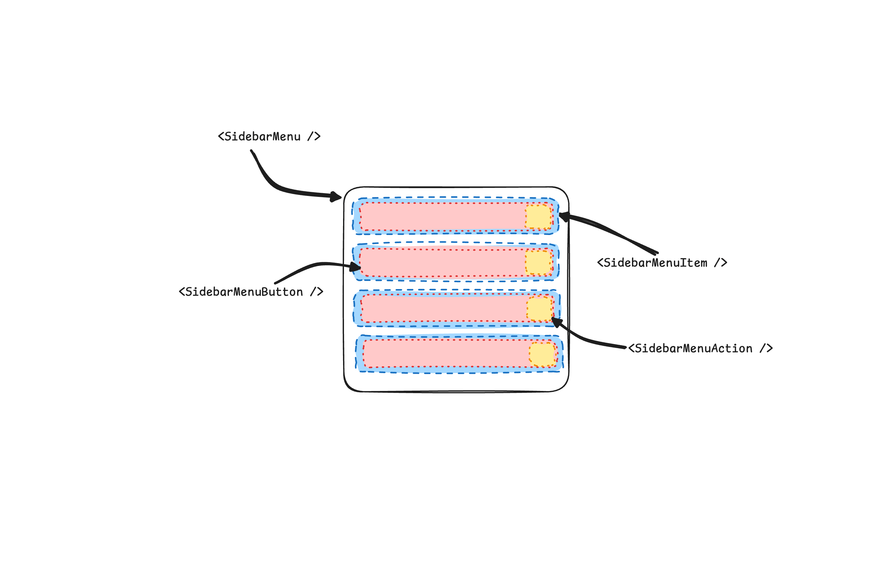 ```templ showLineNumbers
@sidebar.Menu() {
for _, project := range projects {
@sidebar.MenuItem() {
@sidebar.MenuButton(sidebar.MenuButtonProps{Href: project.URL}) {
@project.Icon()
{ project.Name }
}
}
}
}
```
## SidebarMenuButton
The `sidebar.MenuButton` component is used to render a menu button within a `sidebar.MenuItem`.
By default, the `sidebar.MenuButton` renders a button. Set the `Href` prop to render an `a` tag instead.
Use the `IsActive` prop to mark a menu item as active.
```templ showLineNumbers
@sidebar.MenuButton(sidebar.MenuButtonProps{Href: "#", IsActive: true}) {
Home
}
```
## SidebarMenuAction
The `sidebar.MenuAction` component is used to render a menu action within a `sidebar.MenuItem`.
```templ showLineNumbers
@sidebar.MenuItem() {
@sidebar.MenuButton(sidebar.MenuButtonProps{Href: "#"}) {
@icon.House()
Home
}
@sidebar.MenuAction() {
@icon.Plus()
Add Project
}
}
```
## SidebarMenuSub
The `sidebar.MenuSub` component is used to render a submenu within a `sidebar.Menu`.
```templ showLineNumbers
@sidebar.MenuItem() {
@sidebar.MenuButton()
@sidebar.MenuSub() {
@sidebar.MenuSubItem() {
@sidebar.MenuSubButton()
}
}
}
```
## SidebarMenuBadge
The `sidebar.MenuBadge` component is used to render a badge within a `sidebar.MenuItem`.
```templ showLineNumbers
@sidebar.MenuItem() {
@sidebar.MenuButton()
@sidebar.MenuBadge() {
24
}
}
```
## SidebarMenuSkeleton
The `sidebar.MenuSkeleton` component is used to render a skeleton for a `sidebar.Menu`.
```templ showLineNumbers
@sidebar.Menu() {
for range 5 {
@sidebar.MenuItem() {
@sidebar.MenuSkeleton()
}
}
}
```
## SidebarTrigger
Use the `sidebar.Trigger` component to render a button that toggles the sidebar.
```templ showLineNumbers
```
## SidebarRail
The `sidebar.Rail` component is used to render a rail within a `sidebar.Sidebar`. This rail can be used to toggle the sidebar.
```templ showLineNumbers
@sidebar.Sidebar() {
@sidebar.Header()
@sidebar.Content() {
@sidebar.Group()
}
@sidebar.Footer()
@sidebar.Rail()
}
```
## Controlled Sidebar
Use the `DisableDefaultOpen` prop on `sidebar.Provider` to render the sidebar collapsed on the server. The `sidebar_state` cookie carries the last state, so the server can render the sidebar the way the user left it.
```templ showLineNumbers
@sidebar.Provider(sidebar.ProviderProps{DisableDefaultOpen: collapsedFromCookie})
```
```go showLineNumbers
collapsed := false
if c, err := r.Cookie("sidebar_state"); err == nil {
collapsed = c.Value == "false"
}
```
## Theming
We use the following CSS variables to theme the sidebar.
```css
:root {
--sidebar: oklch(0.985 0 0);
--sidebar-foreground: oklch(0% 0 0);
--sidebar-primary: oklch(0.205 0 0);
--sidebar-primary-foreground: oklch(0.985 0 0);
--sidebar-accent: oklch(0.97 0 0);
--sidebar-accent-foreground: oklch(0.205 0 0);
--sidebar-border: oklch(0.922 0 0);
--sidebar-ring: oklch(0.708 0 0);
}
.dark {
--sidebar: oklch(0.205 0 0);
--sidebar-foreground: oklch(0.985 0 0);
--sidebar-primary: oklch(0.488 0.243 264.376);
--sidebar-primary-foreground: oklch(0.985 0 0);
--sidebar-accent: oklch(0.269 0 0);
--sidebar-accent-foreground: oklch(0.985 0 0);
--sidebar-border: oklch(1 0 0 / 10%);
--sidebar-ring: oklch(0.439 0 0);
}
```
## Styling
Here are some tips for styling the sidebar based on different states.
```templ
@sidebar.Sidebar(sidebar.Props{Collapsible: sidebar.CollapsibleIcon}) {
@sidebar.Content() {
@sidebar.Group(sidebar.GroupProps{Class: "group-data-[collapsible=icon]:hidden"})
}
}
```
```templ
@sidebar.MenuItem() {
@sidebar.MenuButton()
@sidebar.MenuAction(sidebar.MenuActionProps{Class: "peer-data-[active=true]/menu-button:opacity-100"})
}
```
```templ showLineNumbers
@sidebar.Menu() {
for _, project := range projects {
@sidebar.MenuItem() {
@sidebar.MenuButton(sidebar.MenuButtonProps{Href: project.URL}) {
@project.Icon()
{ project.Name }
}
}
}
}
```
## SidebarMenuButton
The `sidebar.MenuButton` component is used to render a menu button within a `sidebar.MenuItem`.
By default, the `sidebar.MenuButton` renders a button. Set the `Href` prop to render an `a` tag instead.
Use the `IsActive` prop to mark a menu item as active.
```templ showLineNumbers
@sidebar.MenuButton(sidebar.MenuButtonProps{Href: "#", IsActive: true}) {
Home
}
```
## SidebarMenuAction
The `sidebar.MenuAction` component is used to render a menu action within a `sidebar.MenuItem`.
```templ showLineNumbers
@sidebar.MenuItem() {
@sidebar.MenuButton(sidebar.MenuButtonProps{Href: "#"}) {
@icon.House()
Home
}
@sidebar.MenuAction() {
@icon.Plus()
Add Project
}
}
```
## SidebarMenuSub
The `sidebar.MenuSub` component is used to render a submenu within a `sidebar.Menu`.
```templ showLineNumbers
@sidebar.MenuItem() {
@sidebar.MenuButton()
@sidebar.MenuSub() {
@sidebar.MenuSubItem() {
@sidebar.MenuSubButton()
}
}
}
```
## SidebarMenuBadge
The `sidebar.MenuBadge` component is used to render a badge within a `sidebar.MenuItem`.
```templ showLineNumbers
@sidebar.MenuItem() {
@sidebar.MenuButton()
@sidebar.MenuBadge() {
24
}
}
```
## SidebarMenuSkeleton
The `sidebar.MenuSkeleton` component is used to render a skeleton for a `sidebar.Menu`.
```templ showLineNumbers
@sidebar.Menu() {
for range 5 {
@sidebar.MenuItem() {
@sidebar.MenuSkeleton()
}
}
}
```
## SidebarTrigger
Use the `sidebar.Trigger` component to render a button that toggles the sidebar.
```templ showLineNumbers
```
## SidebarRail
The `sidebar.Rail` component is used to render a rail within a `sidebar.Sidebar`. This rail can be used to toggle the sidebar.
```templ showLineNumbers
@sidebar.Sidebar() {
@sidebar.Header()
@sidebar.Content() {
@sidebar.Group()
}
@sidebar.Footer()
@sidebar.Rail()
}
```
## Controlled Sidebar
Use the `DisableDefaultOpen` prop on `sidebar.Provider` to render the sidebar collapsed on the server. The `sidebar_state` cookie carries the last state, so the server can render the sidebar the way the user left it.
```templ showLineNumbers
@sidebar.Provider(sidebar.ProviderProps{DisableDefaultOpen: collapsedFromCookie})
```
```go showLineNumbers
collapsed := false
if c, err := r.Cookie("sidebar_state"); err == nil {
collapsed = c.Value == "false"
}
```
## Theming
We use the following CSS variables to theme the sidebar.
```css
:root {
--sidebar: oklch(0.985 0 0);
--sidebar-foreground: oklch(0% 0 0);
--sidebar-primary: oklch(0.205 0 0);
--sidebar-primary-foreground: oklch(0.985 0 0);
--sidebar-accent: oklch(0.97 0 0);
--sidebar-accent-foreground: oklch(0.205 0 0);
--sidebar-border: oklch(0.922 0 0);
--sidebar-ring: oklch(0.708 0 0);
}
.dark {
--sidebar: oklch(0.205 0 0);
--sidebar-foreground: oklch(0.985 0 0);
--sidebar-primary: oklch(0.488 0.243 264.376);
--sidebar-primary-foreground: oklch(0.985 0 0);
--sidebar-accent: oklch(0.269 0 0);
--sidebar-accent-foreground: oklch(0.985 0 0);
--sidebar-border: oklch(1 0 0 / 10%);
--sidebar-ring: oklch(0.439 0 0);
}
```
## Styling
Here are some tips for styling the sidebar based on different states.
```templ
@sidebar.Sidebar(sidebar.Props{Collapsible: sidebar.CollapsibleIcon}) {
@sidebar.Content() {
@sidebar.Group(sidebar.GroupProps{Class: "group-data-[collapsible=icon]:hidden"})
}
}
```
```templ
@sidebar.MenuItem() {
@sidebar.MenuButton()
@sidebar.MenuAction(sidebar.MenuActionProps{Class: "peer-data-[active=true]/menu-button:opacity-100"})
}
```
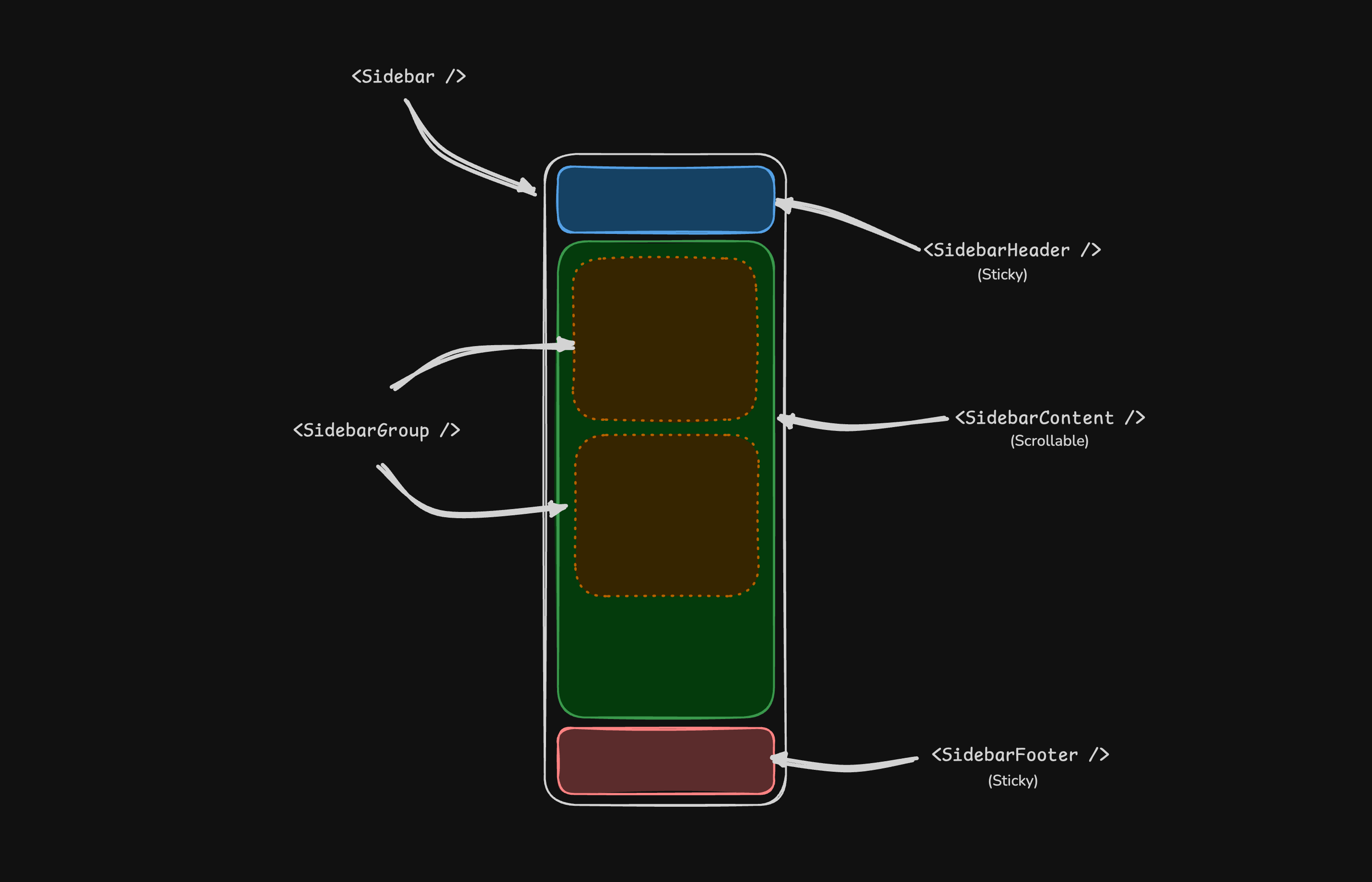 ## SidebarProvider
The `sidebar.Provider` component provides the sidebar context to the `sidebar.Sidebar` component. You should always wrap your application in a `sidebar.Provider` component.
### Props
| Name | Type | Description |
| ----------- | ------ | --------------------------------------- |
| `DisableDefaultOpen` | `bool` | Default collapsed state of the sidebar. |
### Width
If you have a single sidebar in your application, you can use the `sidebarWidth` and `sidebarWidthMobile` constants in `sidebar.templ` to set the width of the sidebar.
```go showLineNumbers title="components/sidebar/sidebar.templ"
sidebarWidth = "16rem"
sidebarWidthMobile = "18rem"
```
For multiple sidebars in your application, you can use the `--sidebar-width` and `--sidebar-width-mobile` CSS variables in the `style` attribute.
```templ showLineNumbers
@sidebar.Provider(sidebar.ProviderProps{
Attributes: templ.Attributes{
"style": "--sidebar-width: 20rem; --sidebar-width-mobile: 20rem;",
},
}) {
@sidebar.Sidebar()
}
```
### Keyboard Shortcut
To trigger the sidebar, you use the `cmd+b` keyboard shortcut on Mac and `ctrl+b` on Windows.
```go showLineNumbers title="components/sidebar/sidebar.templ"
sidebarKeyboardShortcut = "b"
```
## Sidebar
The main `sidebar.Sidebar` component used to render a collapsible sidebar.
### Props
| Property | Type | Description |
| ------------- | ------------------------------------------------------------ | --------------------------------- |
| `Side` | `SideLeft` or `SideRight` | The side of the sidebar. |
| `Variant` | `VariantSidebar`, `VariantFloating`, or `VariantInset` | The variant of the sidebar. |
| `Collapsible` | `CollapsibleOffcanvas`, `CollapsibleIcon`, or `CollapsibleNone` | Collapsible state of the sidebar. |
| Collapsible | Description |
| ----------- | ------------------------------------------------------------ |
| `offcanvas` | A collapsible sidebar that slides in from the left or right. |
| `icon` | A sidebar that collapses to icons. |
| `none` | A non-collapsible sidebar. |
## SidebarProvider
The `sidebar.Provider` component provides the sidebar context to the `sidebar.Sidebar` component. You should always wrap your application in a `sidebar.Provider` component.
### Props
| Name | Type | Description |
| ----------- | ------ | --------------------------------------- |
| `DisableDefaultOpen` | `bool` | Default collapsed state of the sidebar. |
### Width
If you have a single sidebar in your application, you can use the `sidebarWidth` and `sidebarWidthMobile` constants in `sidebar.templ` to set the width of the sidebar.
```go showLineNumbers title="components/sidebar/sidebar.templ"
sidebarWidth = "16rem"
sidebarWidthMobile = "18rem"
```
For multiple sidebars in your application, you can use the `--sidebar-width` and `--sidebar-width-mobile` CSS variables in the `style` attribute.
```templ showLineNumbers
@sidebar.Provider(sidebar.ProviderProps{
Attributes: templ.Attributes{
"style": "--sidebar-width: 20rem; --sidebar-width-mobile: 20rem;",
},
}) {
@sidebar.Sidebar()
}
```
### Keyboard Shortcut
To trigger the sidebar, you use the `cmd+b` keyboard shortcut on Mac and `ctrl+b` on Windows.
```go showLineNumbers title="components/sidebar/sidebar.templ"
sidebarKeyboardShortcut = "b"
```
## Sidebar
The main `sidebar.Sidebar` component used to render a collapsible sidebar.
### Props
| Property | Type | Description |
| ------------- | ------------------------------------------------------------ | --------------------------------- |
| `Side` | `SideLeft` or `SideRight` | The side of the sidebar. |
| `Variant` | `VariantSidebar`, `VariantFloating`, or `VariantInset` | The variant of the sidebar. |
| `Collapsible` | `CollapsibleOffcanvas`, `CollapsibleIcon`, or `CollapsibleNone` | Collapsible state of the sidebar. |
| Collapsible | Description |
| ----------- | ------------------------------------------------------------ |
| `offcanvas` | A collapsible sidebar that slides in from the left or right. |
| `icon` | A sidebar that collapses to icons. |
| `none` | A non-collapsible sidebar. |
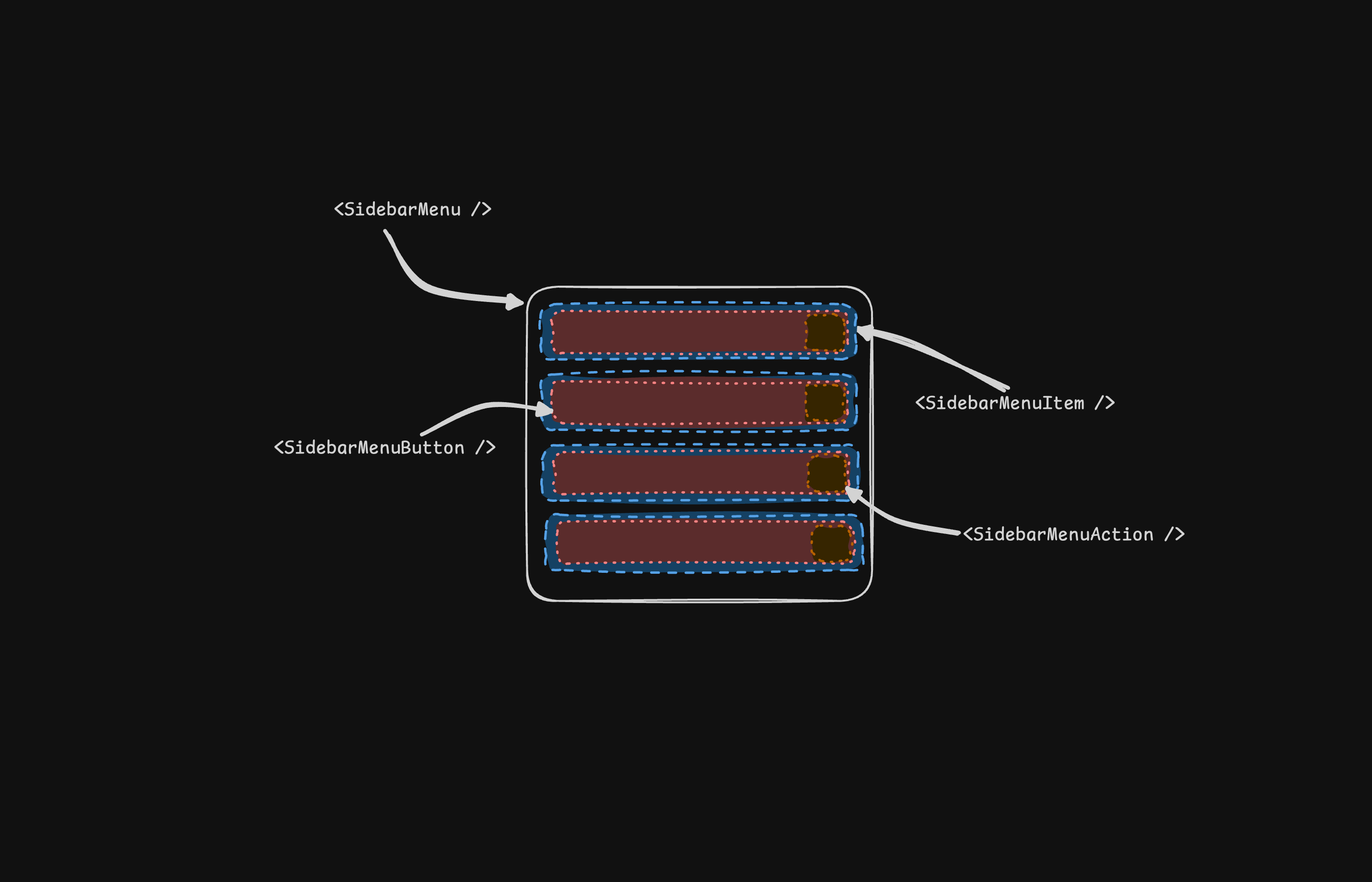 ```templ showLineNumbers
@sidebar.Menu() {
for _, project := range projects {
@sidebar.MenuItem() {
@sidebar.MenuButton(sidebar.MenuButtonProps{Href: project.URL}) {
@project.Icon()
```templ showLineNumbers
@sidebar.Menu() {
for _, project := range projects {
@sidebar.MenuItem() {
@sidebar.MenuButton(sidebar.MenuButtonProps{Href: project.URL}) {
@project.Icon()